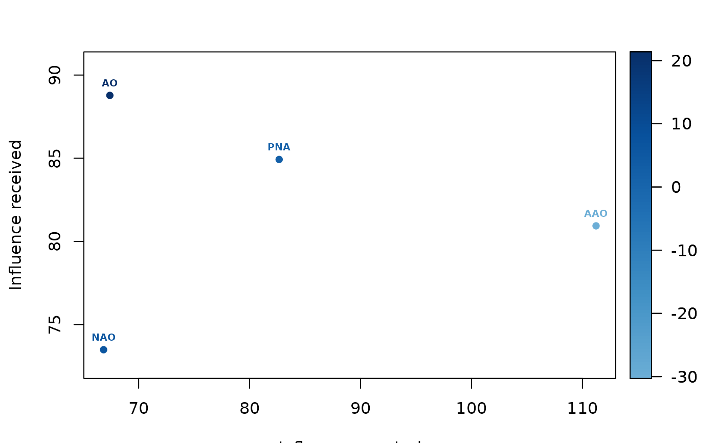
The plotEffect function generates a plot to visualize the effects of positive, negative, or dark causality based on the results from the pcEffect function. It displays the influence exerted versus influence received for each item, providing a clear graphical representation of the causality effects.
Arguments
- effects
A list containing data frames of causality effects for positive, negative, and dark influences, as returned by the
pcEffectfunction. Each data frame includes columns for received influence, exerted influence, and the difference between them.- status
A character string specifying which causality effect to plot. Must be one of
"positive","negative", or"dark".- addlabel
A logical value indicating whether to add labels to the plot. Defaults to
TRUE.
Value
A scatter plot visualizing the relationship between influence exerted and influence received for the specified causality type. The plot also includes color coding to represent the difference in influence.
Examples
# \donttest{
data(climate_indices)
dataset <- climate_indices[,-1]
pcmatrix <- pcMatrix(dataset, E = 3, tau = 1, metric = "euclidean", h = 1, weighted = TRUE)
#> CAUSE:  AO
#> EFFECT:  AO
#> EFFECT:  AAO
#> EFFECT:  NAO
#> EFFECT:  PNA
#> CAUSE:  AAO
#> EFFECT:  AO
#> EFFECT:  AAO
#> EFFECT:  NAO
#> EFFECT:  PNA
#> CAUSE:  NAO
#> EFFECT:  AO
#> EFFECT:  AAO
#> EFFECT:  NAO
#> EFFECT:  PNA
#> CAUSE:  PNA
#> EFFECT:  AO
#> EFFECT:  AAO
#> EFFECT:  NAO
#> EFFECT:  PNA
#> Calculation duration:  7.73490285873413
effects <- pcEffect(pcmatrix)
plotEffect(effects, status = "positive", addlabel = TRUE)

# }
# }
