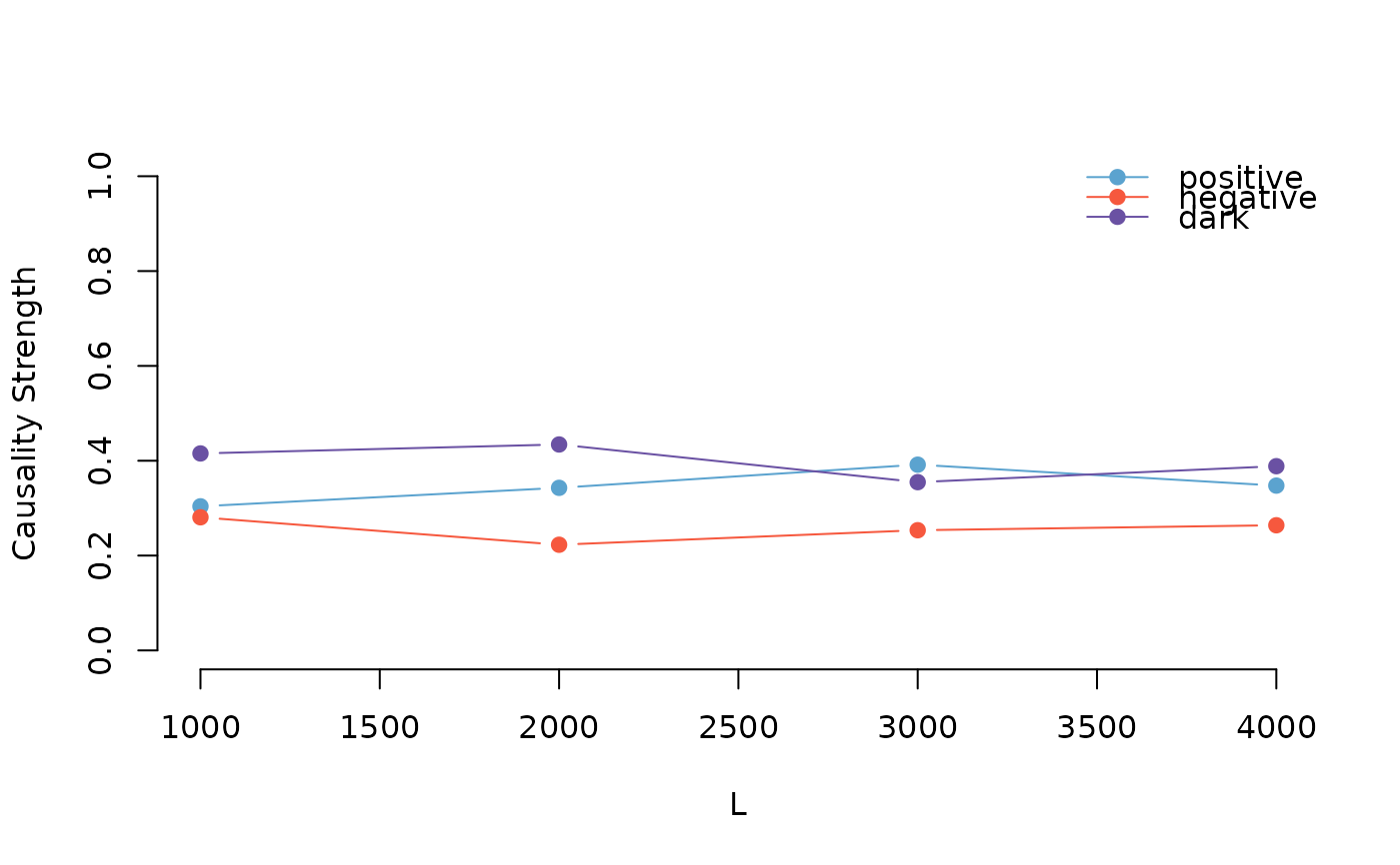
The plotCV function generates a plot to visualize the results of cross-validation for pattern causality. It displays the positive, negative, and dark causality strengths across different sample sizes, providing a clear graphical representation of the cross-validation outcomes.
Value
A plot visualizing the positive, negative, and dark causality strengths across different sample sizes. The plot includes points and lines for each causality type, along with a legend for easy interpretation.
Examples
# \donttest{
data(DJS)
X <- DJS$X3M
Y <- DJS$American.Express
numberset <- c(1000,2000,3000,4000)
result <- pcCrossValidation(X,Y,3,2,"euclidean",1,FALSE,numberset)
#>
  |
  |                                                                |   0%
  |
  |#####################                                           |  33%
  |
  |###########################################                     |  67%
  |
  |################################################################| 100%
plotCV(result,FALSE)

# }
# }
